search the Original Green Blog

There’s a strongly-held view in some architectural camps that minimalist design is unlovable, but I believe that’s a misconception based on the famously-sterile architecture of the 1970s. I even railed in last week’s post against the dangers of pursuing minimalist design so hard that we get rid of essential things. So let’s take a look at ways clean design can achieve lovability.
General Principles
Love and Respect

It’s hard for design to be lovable and therefore sustainable if it’s not respectful of its setting.
Wanda and I moved to Miami eleven years ago, buying a unit at The Dixon, a noted Art Deco landmark in the heart of South Beach. If you’re a regular reader of this blog, you know I’m a long-time advocate of lovability as the first foundation of sustainable buildings because if a building can’t be loved, it won’t last, because we'll find some excuse to rid ourselves of the unlovable. But I’m also a huge advocate for contextual design that respects its surroundings, so it was a foregone conclusion that our renovated condo would not look like something we might have done in another setting. Instead, it became an intriguing exploration of a new part of the character of lovability.
Essential Things

The high standard of great minimalism is losing no essential thing while keeping no unnecessary thing.
Our bedroom is the simplest room I have ever designed, and I thought for a long time about what was really needed. A tent is exotic yet peaceful to me. The bedroom was almost perfectly square to begin with, so I began by encircling the room with a curtain that is precisely an eleven foot square.

The curtain runs across everything… windows, closets, yes, even the door. Come into the room and close the curtain and it’s very much like being in a tent. It’s also very quiet because the fabric absorbs so much sound. Andrés Duany said “this room feels better than any room I’ve been in for a long time for reasons I can’t quite describe.
The huge white ceiling fan indulges a bit of fancy with a nod to our island home: each blade’s spine is a fishing rod stretching sail cloth into a blade. The bed is a white leather platform bed with a white down comforter. There are only two other things in the room (other than us): two little floor lamps of a perfect height for reading in bed.
Other than that, what is really necessary? And editing all those other normal bedroom artifacts out creates a couple’s retreat so immersed with and peace and calm that it borders on the sublime.
A Chef's Kitchen

Visual simplicity in a kitchen hides all the tools from view. Far better to see everything, so cooking is simple.
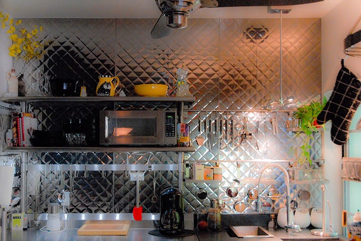
Our kitchen is a very different room from our bedroom. It abandons the visual simplicity of the bedroom so that it can achieve simplicity of use. Our son Sam, a graduate of the Culinary Institute of America, calls this a “chef’s kitchen,” the opposite of which is a “show kitchen.”

A chef’s kitchen creates a different sort of lovability. By being quirky, engaging and warm, it invites others to join in and cook together, like Wanda is doing with her sister Janna here. Several types of lovability are delivered by the design itself, but in this case, the design merely sets the stage for people to have experiences they will recall in pleasant memories.
Detailed Principles
Things that Curve

No part of the body is without curve. We resonate with design that reflects curving human form in some way.
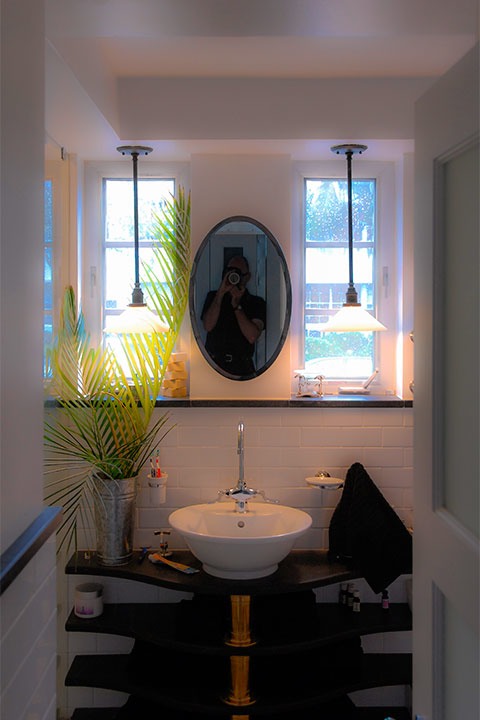
These shelves are soapstone slabs, cut in a gentle mirrored S-curve (or reflected cyma, if you prefer) to honor the Art Deco heritage of the building, as that language of architecture was well-stocked with repeated ribs of various shapes used for many purposes.
Most consruction materials and components are straight, from wood studs to concrete block to sheets of metal roofing. Curves, therefore, are usually quite expensive to achieve. A space composed only of curves would be so exotic that it might even seem psychedelic, as you might recall if you’ve ever seen any of the 1960s architecture that tried to do precisely that. So use curves sparingly, but don’t forget about them because well-designed things that remind us of our own form usually get points for lovability.
Things that Grow

Places that welcome living things, plant or animal, tend to be more lovable than those too polished to be bothered.
We’ve all seen rooms so visually sophisticated, whether classical or modern, that it seems as if any intrusion might degrade them. “Too perfect to live in” is a description I’ve heard countless times for places like this.
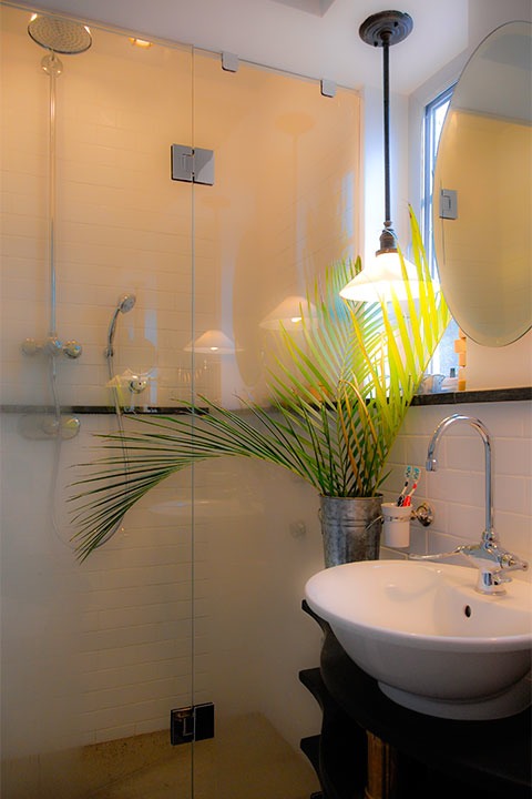
Because minimalism falls off this cliff faster than classicism, it’s really important for a minimalist space to be imperfect enough to accept various life forms. And a minimalist room arguably benefits most, because these two palm fronds arguably make a bigger impact in a room like this than they would in one already chock-full of decorative embellishments. Bringing the outdoors in can be a responsible thing as well… Wanda almost always salvages greenery that was trimmed or pruned away, giving it a few more days of life indoors as it delights us in exchange.
Quirky Things

Lovable places frequently are built with at least one thing that brings you up short and makes you chuckle.
The most chuckle-worthy thing in our condo is probably the door casing. For reasons that are a story for another day, I needed the casing to sit very flat against the wall. And I wanted to honor the metal detailing found throughout our Art Deco building in some way. I was walking through one of those great old lumberyards in Miami one day… Shell Lumber, if you know the area. I was looking for something else, but then a piece of flashing caught my eye. It was precisely the right width, and quarter-inch drip crimp not only would hold the free-floating edge straight along its length, but it was a near-perfect metaphor for the edge band often found on classical wood casing. Delighted, I purchased my galvanized-roof-flashing-turned-door-casing and headed back to the condo, where my trim carpenter thought for a moment that I had completely lost my mind… but who still to this day occasionally brings people here to show them his most unusual casing job ever!
Head to Foot

Lovable design reflects the vertical arrangement of the human body, which has a top, a middle, and a bottom.
Most often, reflection of the body from head to foot is thought of as a head, body, and foot, like the capital, shaft, and base of a classical column. But there are other ways of reflecting us as well.
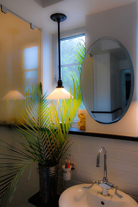
This room, for example, divides between middle and bottom at the waist, marked by a black soapstone belt. The tile wainscot reflects the legs and the black soapstone base (not visible here) reflects the feet, while the mirror and painted wall above the belt reflect the body and the painted coffer reflects the head. It’s a bit of a high waist, but that’s because I needed to align the band with the window sills beyond, as you can see from their reflection in the mirror.
Reflecting Our Faces

We resonate with things that reflect us, including the form of the human face.
It’s not essential for a design to have an abstracted face in order for the design to be lovable, but when you can make that happen, people almost invariably smile. Of all the ways of reflecting the human body, the reflection of our faces reaches us most deeply.
If you’re interested, I’ve posted a portfolio of images of our condo, including these and some other images, on the Studio Sky site. Studio Sky, in case you don’t know, is a design firm I run with two great friends, Eric Moser and Julia Sanford. Our goal is to build places and buildings that are highly sustainable according to Original Green and related ideals. I’m building a really interesting Original Green section on Studio Sky, where I step through each of the foundations of the Original Green, all the way to frugal buildings, illustrating each principle with a collection of patterns, some of which might not have occurred to you yet. You’ll find some of the examples from this post on the lovable buildings page, along with several others. I hope you find these Studio Sky pages useful… please keep coming back, as I’m adding stuff all the time.
If you’re interested, I’m doing a New Media workshop in Celebration, Florida November 8.
Leading with principles that anyone can use for free instead of the normal sales pitch makes Studio Sky’s site a bit unique among designers and builders, but I believe this will be the future of designers’ and builders’ websites. If you’re interested in what the future may hold for us, I’m doing a New Media workshop for designers and builders November 8 in Celebration, Florida. Hope to see you there!
As for this post, it has just touched the tip of the lovability iceberg. Have you had enough, or would you come back for more? I’d be happy to do a series of posts on lovability if anyone’s interested… just leave a note below… thanks!
~Steve Mouzon
Legacy Comments
Wanda Whitley Mouzon · University of Miami
Very clear and well put! Cold sterile interiors cannot achieve the pure delight of a space that is simple but organic!
Terry E. Kearns · Georgia Tech
Bravo. That was a lovable post and a first class selfie.
Sandy Sorlien · Works at Fairmount Water Works
You have proven that minimalism can be lovable! By the way, did you know there's a study showing that kids learn better in uncluttered classrooms.
Bronwyn Boltwood · Ottawa, Ontario
This is something that Ikea is very good at in their marketing material -- making a space look attractive yet lived-in. They look like they contain actual possessions, not just staging accessories or clutter.
Too many spaces are still very sterile -- there was even an article comparing modern office interiors to natural environments, which concluded that messy offices were better because at least there was more stimulation than the sensory deprivation chamber that is a minimalist office. Don't ask me why, but they didn't even ask the question of "how else can we improve office interiors?"
401+


